 Web Development
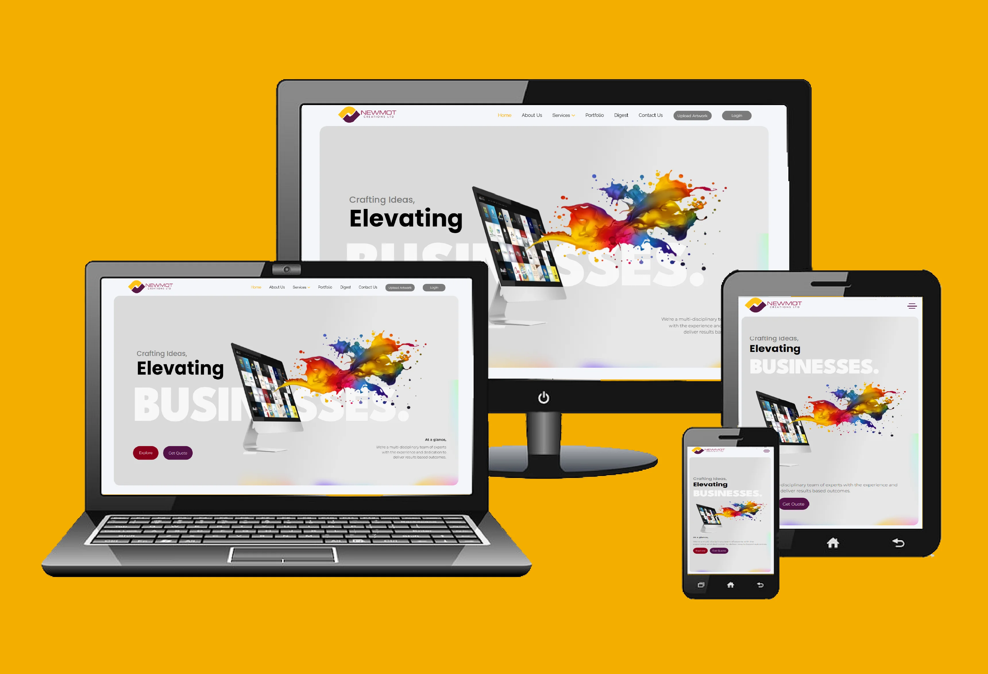
Responsive Design in Kenya: Why It Is a Business Requirement
Responsive design is often treated as a design checkbox. In practice, it is a business reliability issue: if layouts fail on common phones, enquiries drop immediately. This guide covers the responsive fundamentals that protect conversions across devices.
Where responsive failure usually starts
Most problems are predictable: fixed-width sections, tiny tap targets, overflowed tables, and forms that jump when the keyboard opens. These are not edge cases. They happen daily on mid-range Android devices.
A quick field test you can run this week
- Open your homepage on a 360px-wide phone
- Try sending a form with one hand
- Tap every CTA without zooming
- Check if menus close cleanly after navigation
- Repeat on slow mobile data
If any step feels frustrating, users are feeling it too.
Content order is part of responsiveness
On desktop, decorative elements can coexist with detail. On mobile, hierarchy must be strict: value proposition, trust indicator, action path. If users must scroll long before understanding your offer, conversion drops.
Responsive and fast belong together
A mobile-friendly layout still fails if it is heavy. Combine responsive cleanup with speed optimization so rendering and interaction both improve.
Common misconception: "our audience uses desktop"
Even when final decisions happen on desktop, discovery often happens on mobile. First impressions shape whether people return later. Mobile quality is now part of credibility.
Newmot Creations helps teams fix responsive pain points without forcing full redesigns when targeted improvements can solve the issue.
Need Professional Design Support?
Newmot Creations offers practical design and print support with reliable turnaround across Kenya.