 Branding
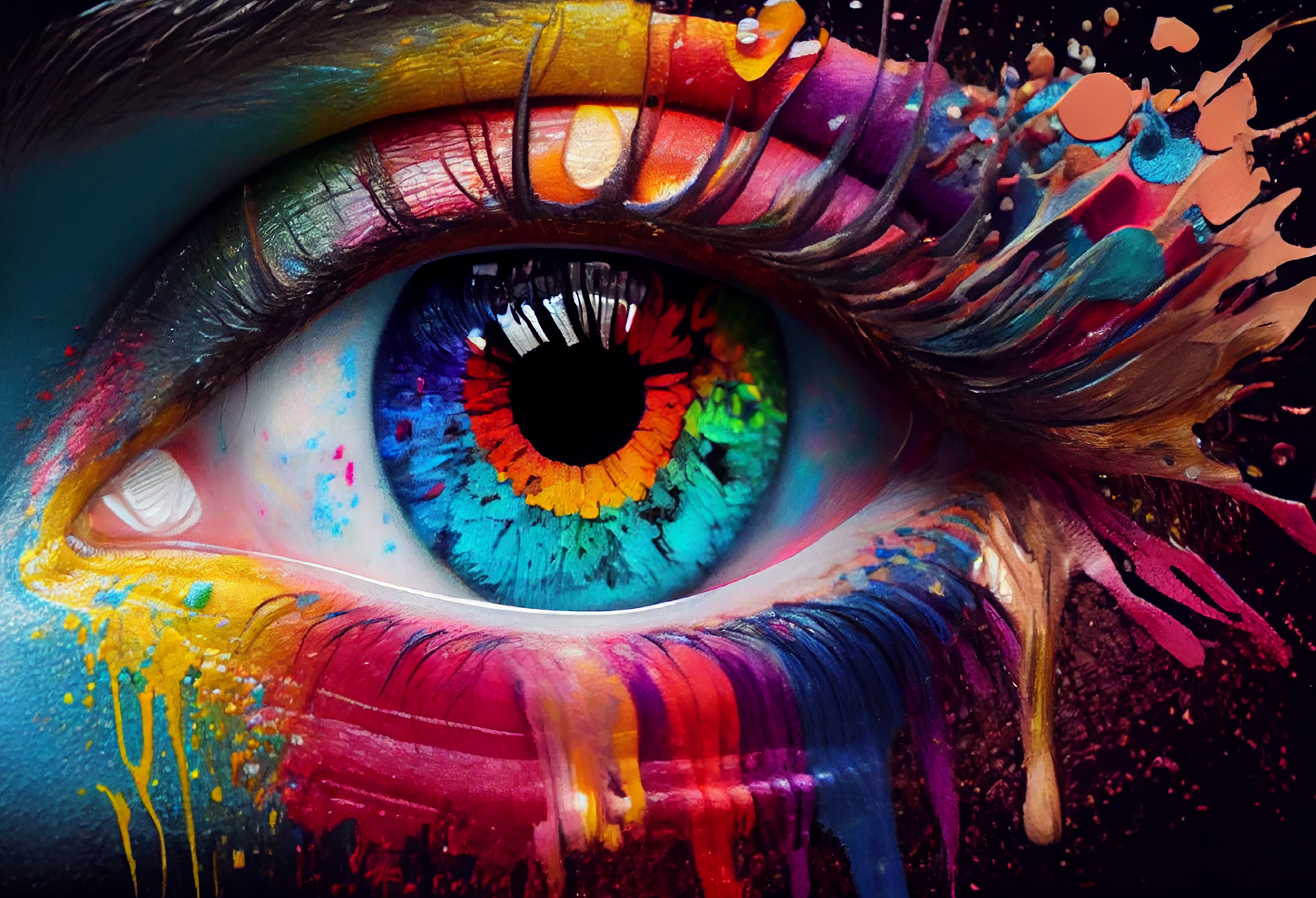
Color Psychology in Kenyan Brand Design: What Actually Matters
Color psychology is often discussed in absolutes, but brand performance is contextual. In practice, the right palette depends on industry cues, readability, and how your brand appears across print and digital touchpoints. This guide focuses on color choices that stay effective in real Kenyan market conditions.
Start with category expectations
Healthcare, finance, food, and creative services all carry different visual expectations. You can stand out, but if you break category cues too aggressively, recognition slows.
Contrast is a business decision
Readable color combinations reduce friction on websites, signage, and print. Many brands choose beautiful palettes that fail basic legibility tests.
Use accent colors intentionally
Your accent color should guide attention to actions like call buttons, pricing highlights, or key labels. If every element is bright, nothing stands out.
Test in real light and real devices
Nairobi sunlight, indoor office lighting, and lower-end screens can all alter perception. Print swatches and mobile tests prevent expensive surprises.
Connect color to brand voice
If your tone is calm and advisory, aggressive neon treatments can feel inconsistent. The visual system should match the way your business speaks.
Related reading
If you are refining a brand system, continue with brand identity planning and logo execution.
Useful external reference
For accessibility and contrast checks, use the WCAG quick reference. It is practical for teams making day-to-day design decisions.
Newmot Creations helps teams select color systems that are expressive and durable across print and digital work.
Need Professional Design Support?
Newmot Creations offers practical design and print support with reliable turnaround across Kenya.